

New images added to the slideshow!
I’m sure you’re well aware that there’s a growing trend of people trying to detach themselves from their phones. As someone who has tried just about every major platform of social media since the MySpace days, I know I’ve found that my attention span has gone to hell as all I do anymore is scroll, scroll, scroll. So, I’ve been finding ways to put my phone down – or at least stay off social media – in an effort to rewire my brain to become less reliant on that algorithm-designed dopamine hit. One thing I’ve been doing instead is recreating the artwork from vintage trading card packages.
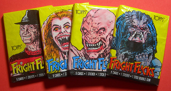
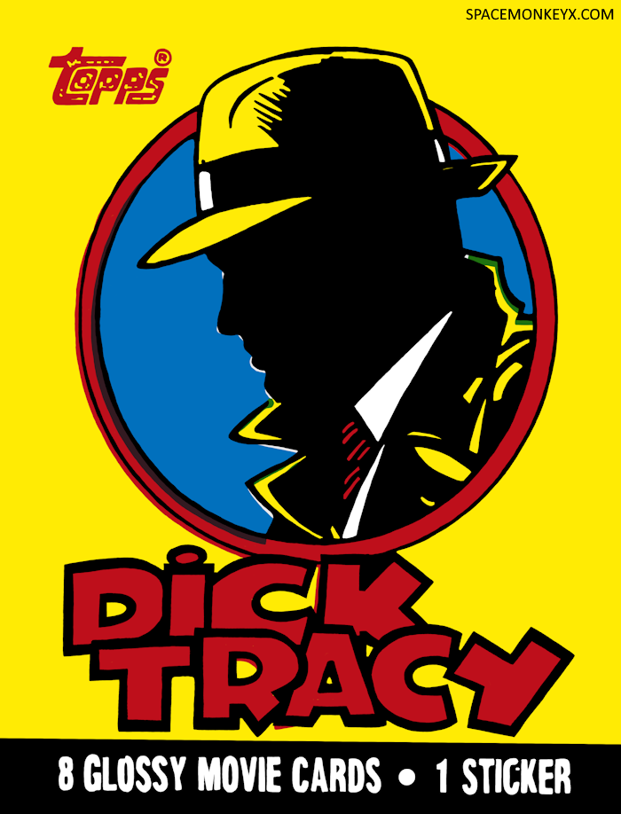
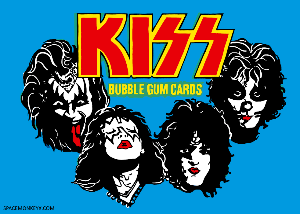
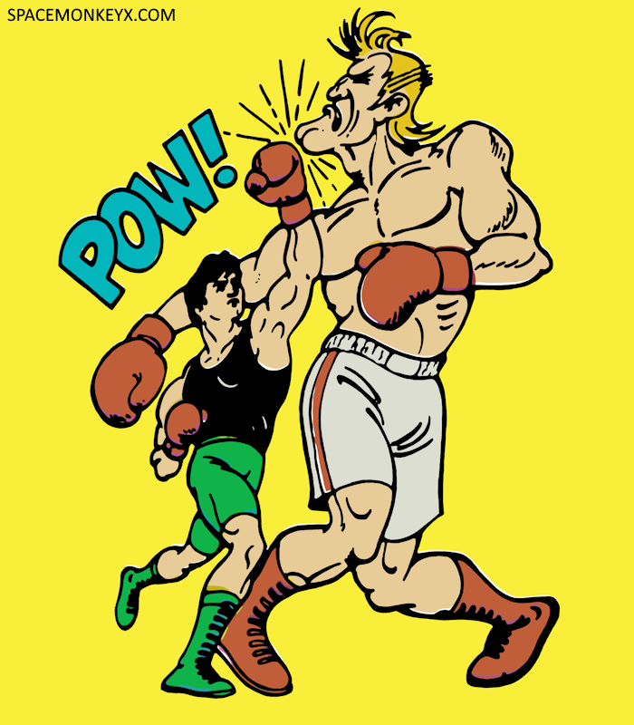
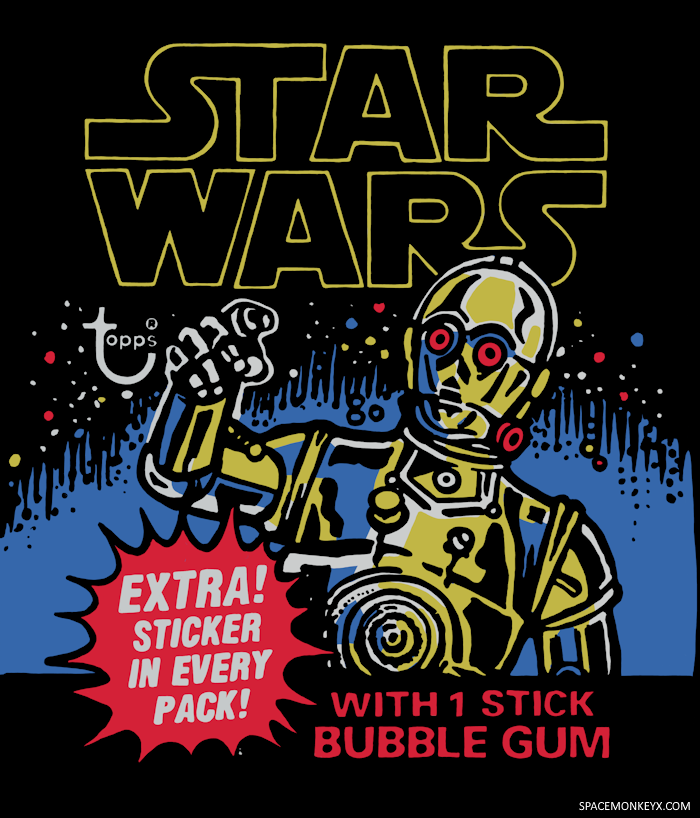
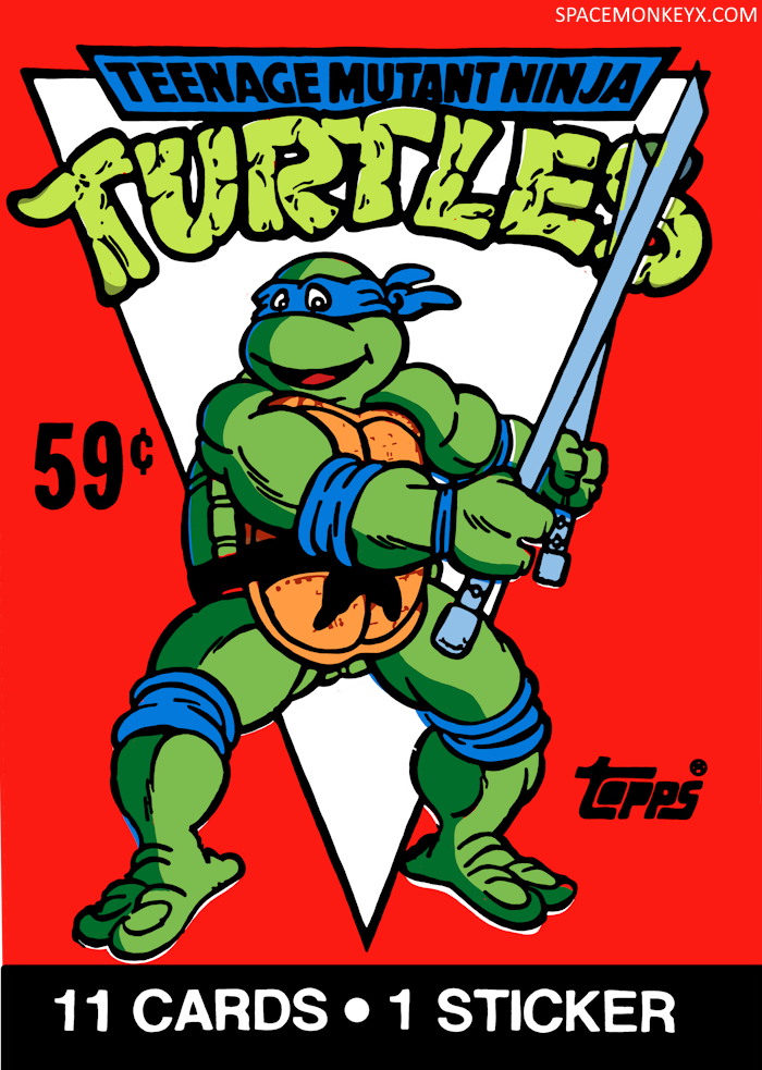
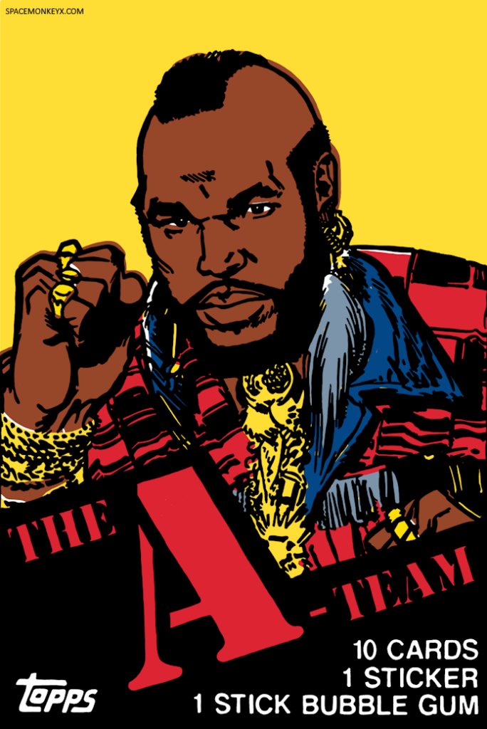
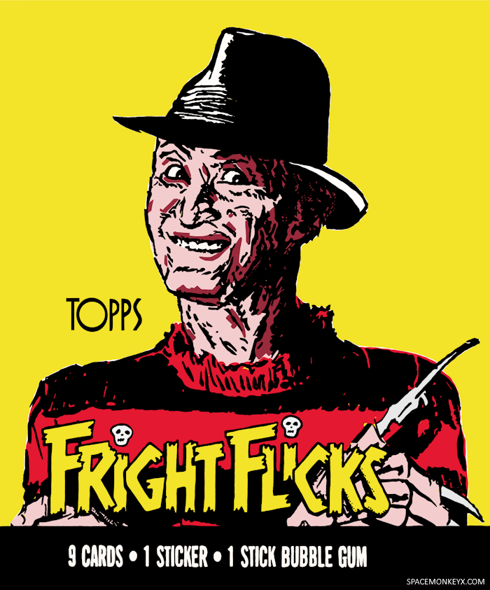
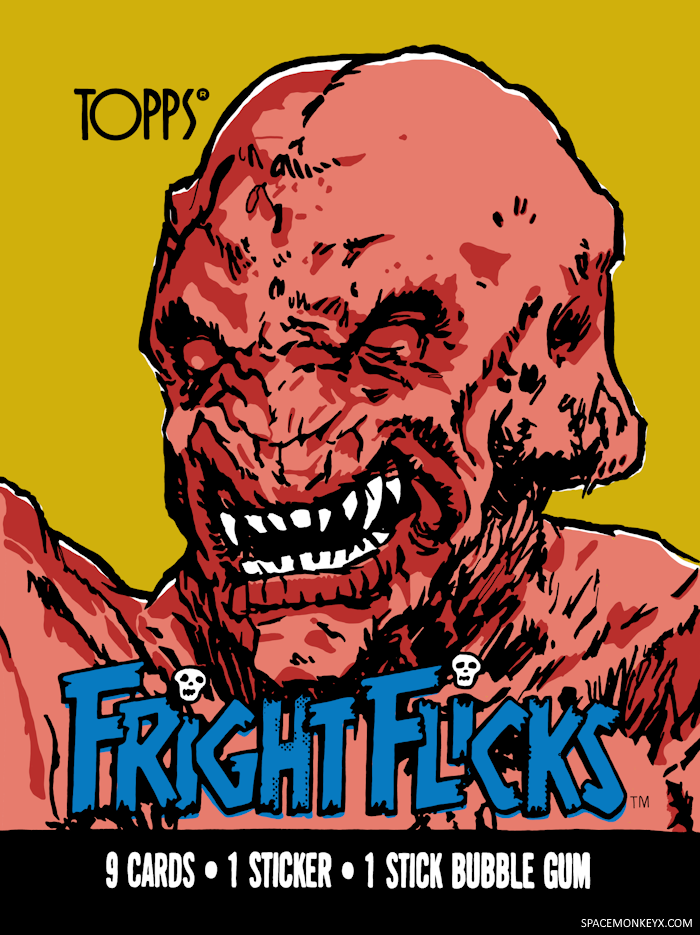
Back in October of this year, I was scrolling through Bluesky and came across a thread of people talking about Fright Flicks, a line of 90 trading cards and 11 stickers released by Topps in 1988 that featured scenes from popular horror movies of the time. There were four wax paper wrappers (the paper gives old trading cards the nickname “waxpacks”) with artwork of Freddy Krueger, The Predator, Pumpkinhead, and Vampire Amy from Fright Night, drawn in a very distinct style that was common on old trading card packaging.
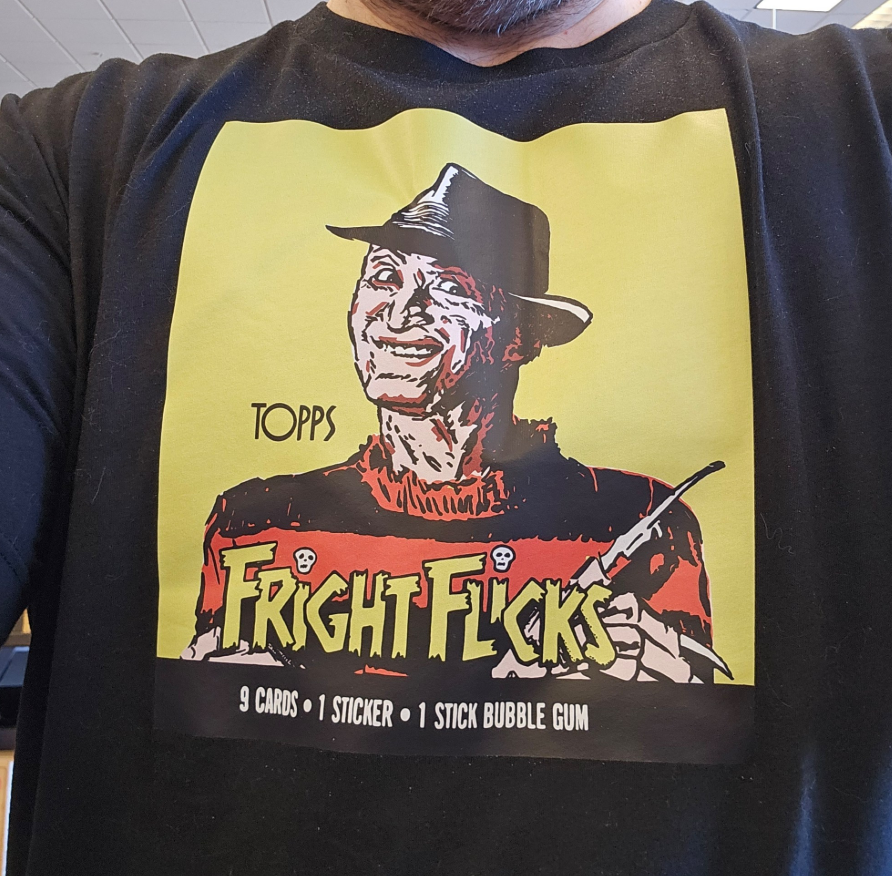
I was already looking for inspiration for a Halloween t-shirt design and I decided it would be cool to recreate the Freddy artwork. I found a photo of the packaging online, brought it into Procreate, and simply began tracing it, using different layers to create the overlapping colors. I was pretty happy with the results and thought it would be fun to do the rest of the Fright Flicks waxpack artwork (so far I’ve only finished Pumpkinhead, but the rest are in-process). The next thing I knew I was scouring the web for waxpacks and spending hours of time recreating them.
And now…this is what I do most nights after everyone else is in bed. I put on a podcast or maybe a Spotify playlist of instrumental music, sit on the couch under a blanket, and I trace old trading card packages. On weekends, if I have spare time, I trace old trading card packages. Instead of doomscrolling or watching silly TikToks for hours on end, I trace old trading card packages. Whatever works, right?
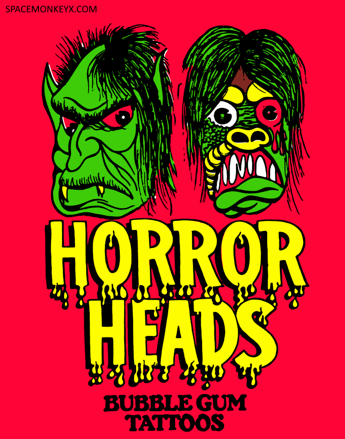
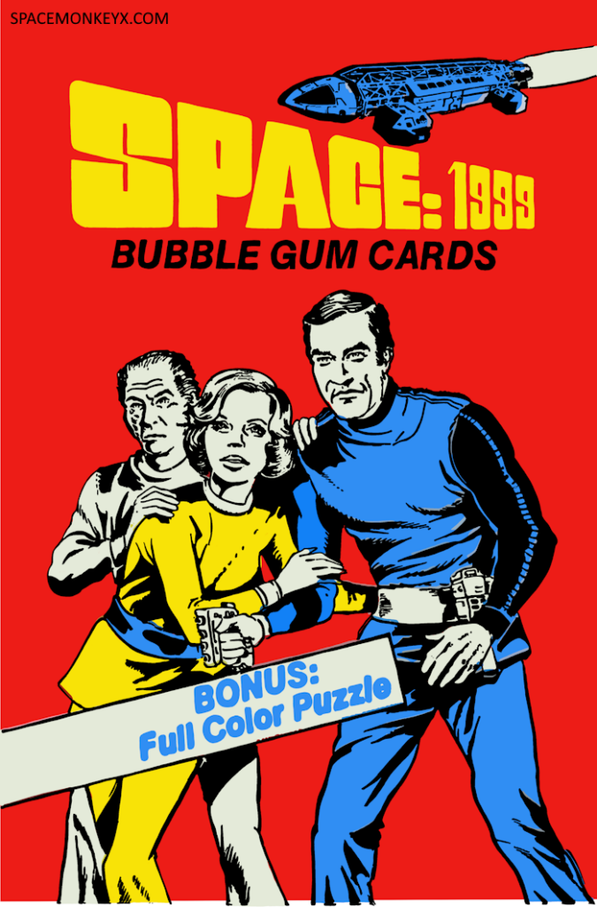
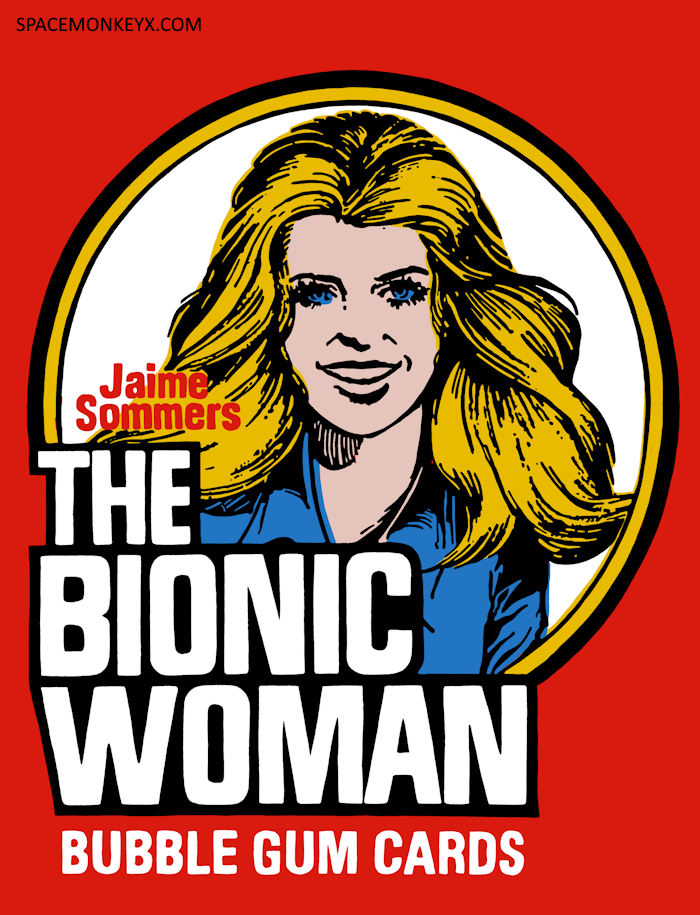
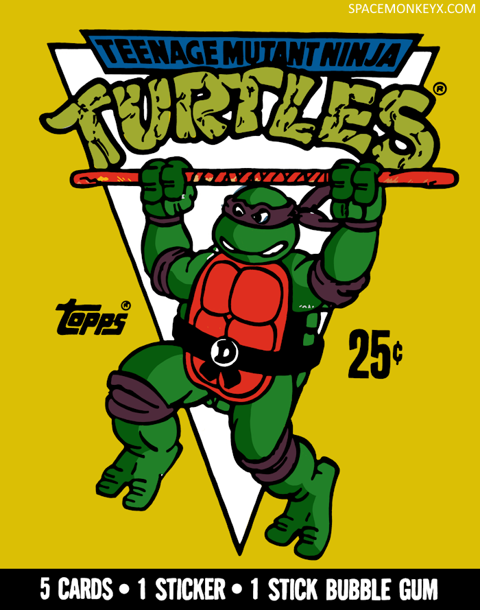
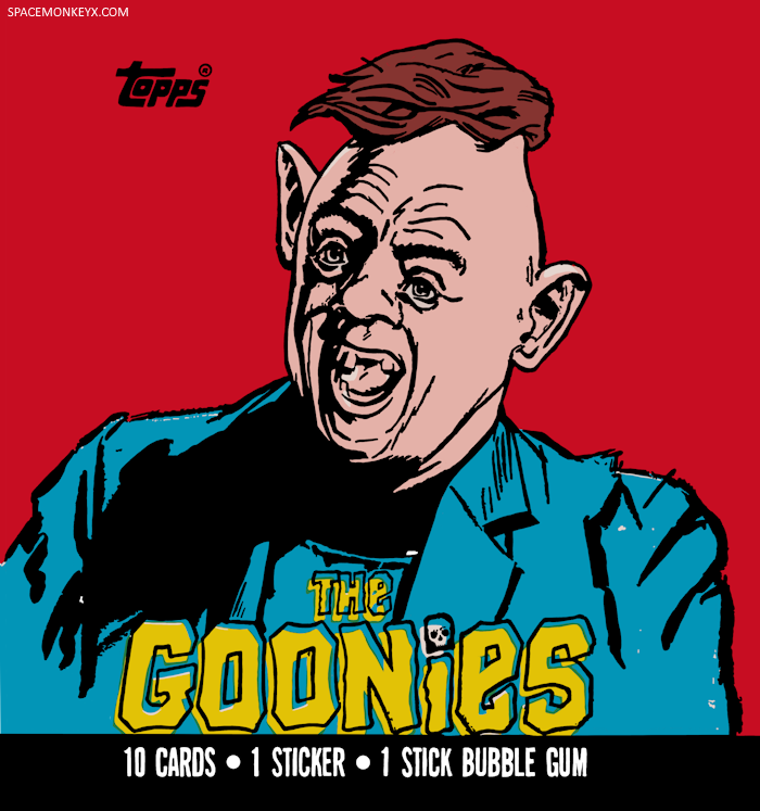
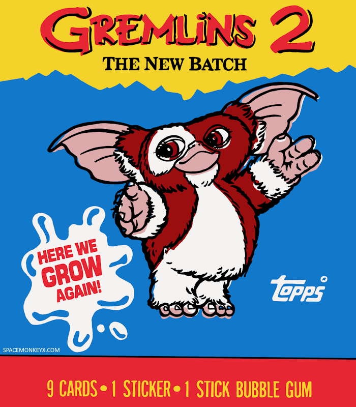
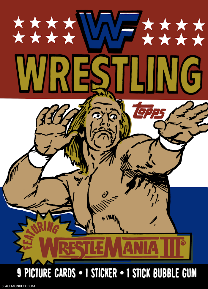
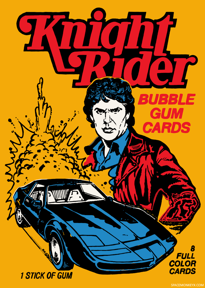
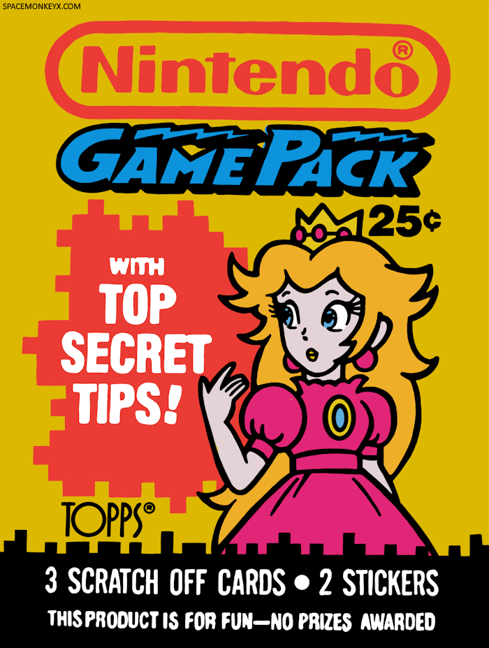
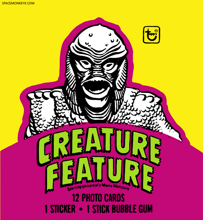
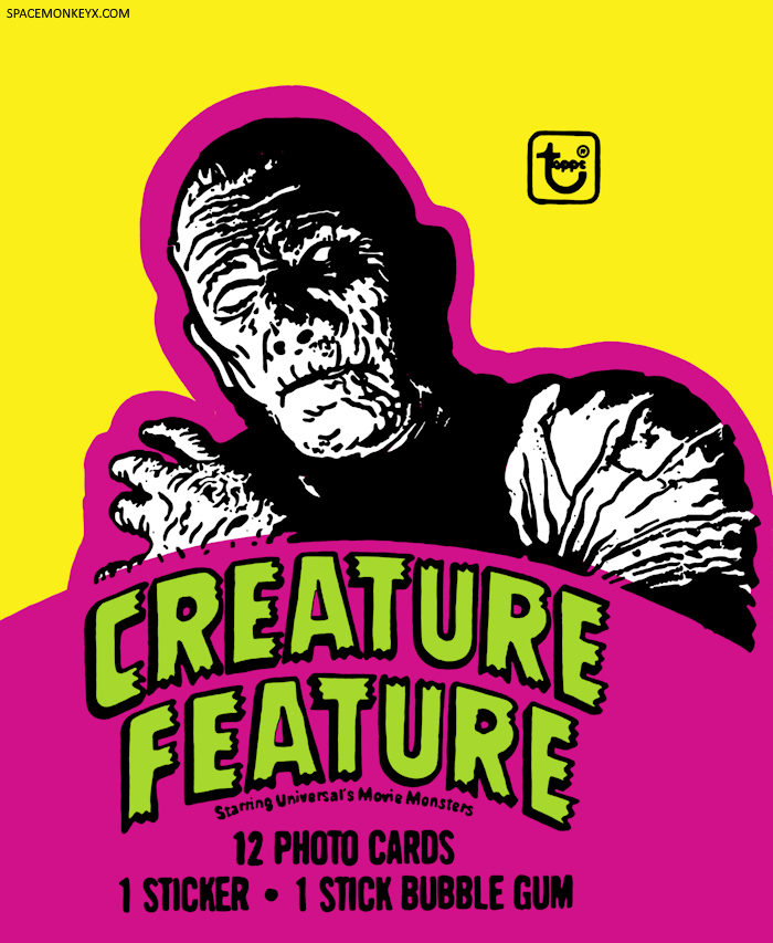
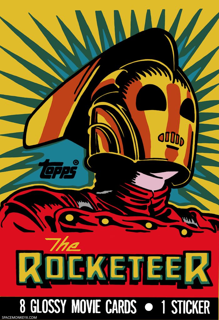
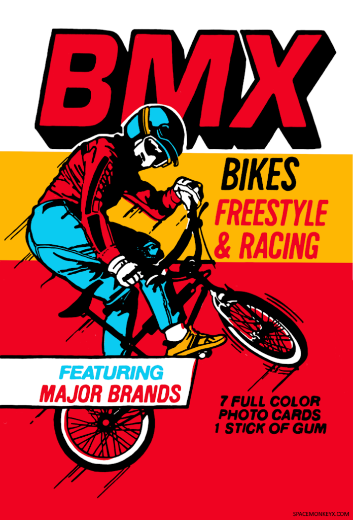
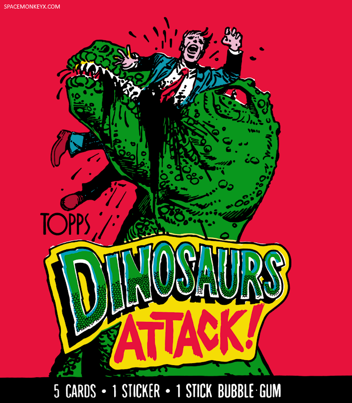
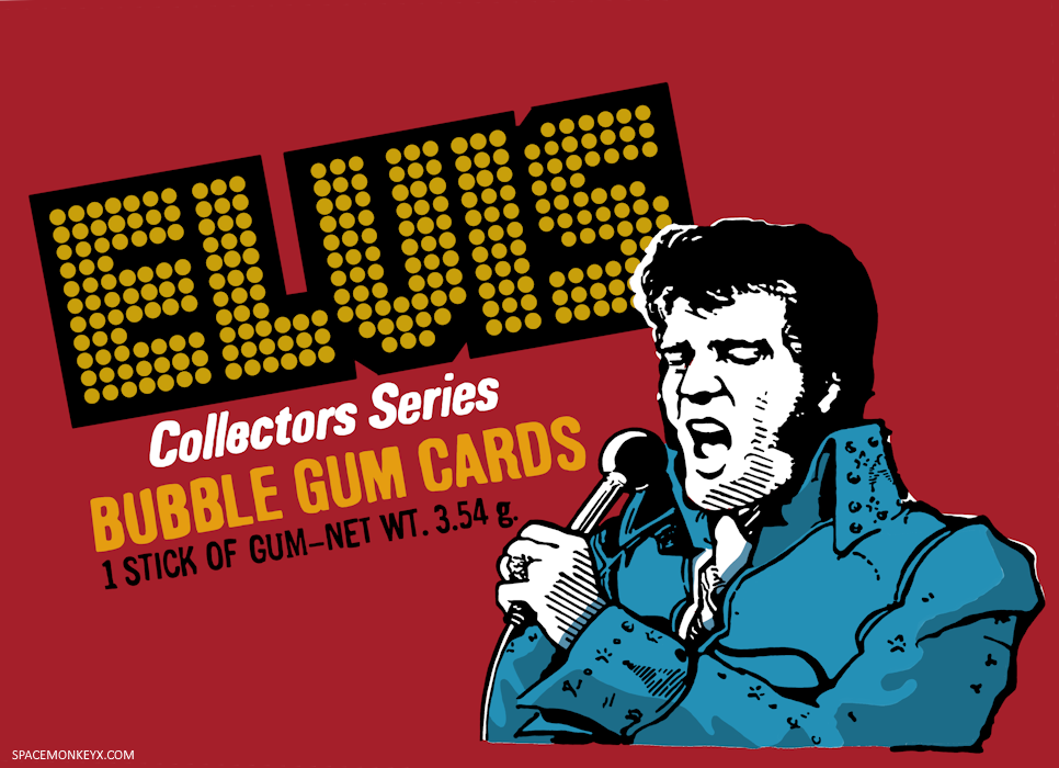
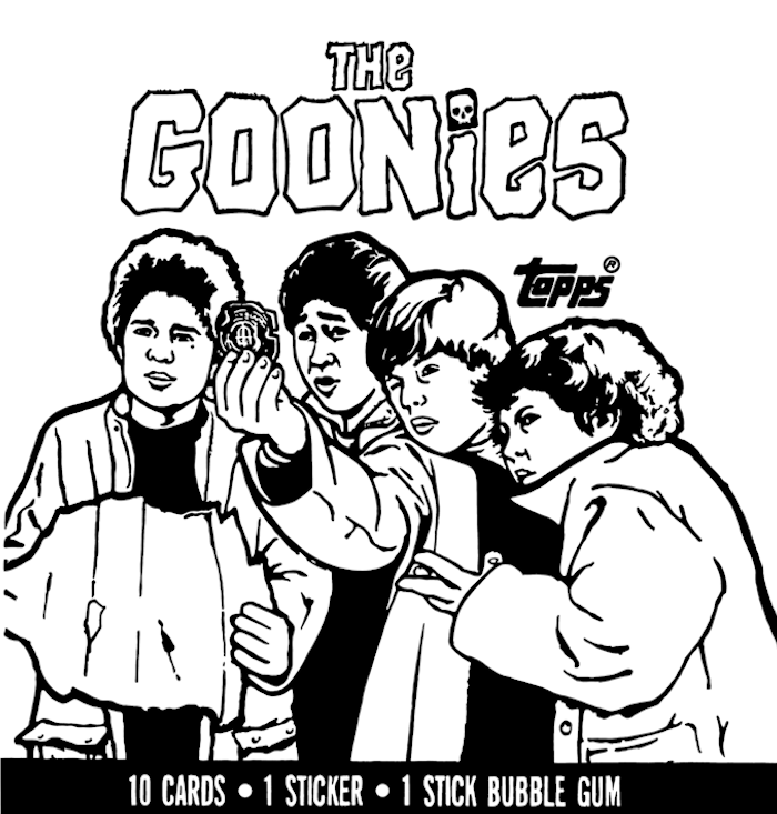
Here’s a gallery of my recreations:


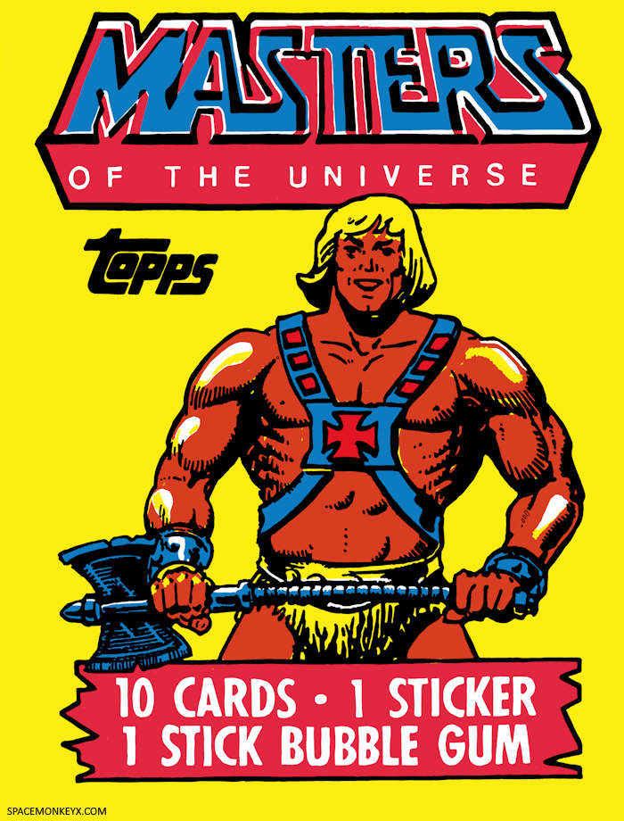


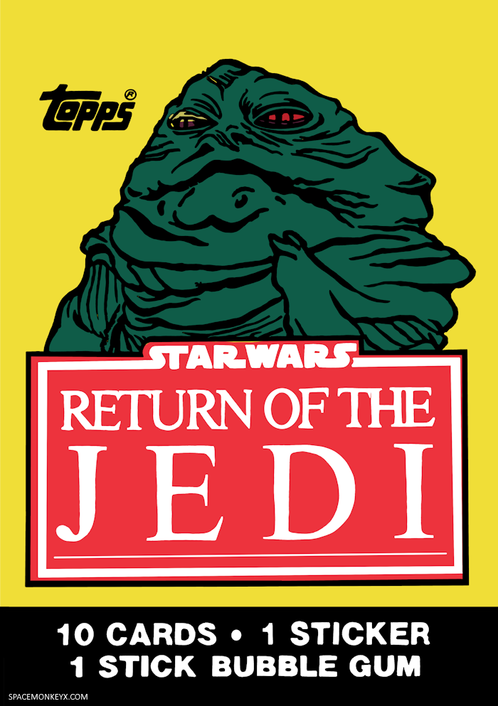
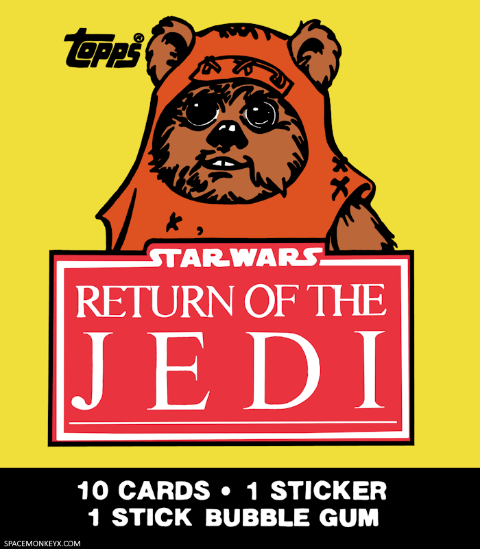


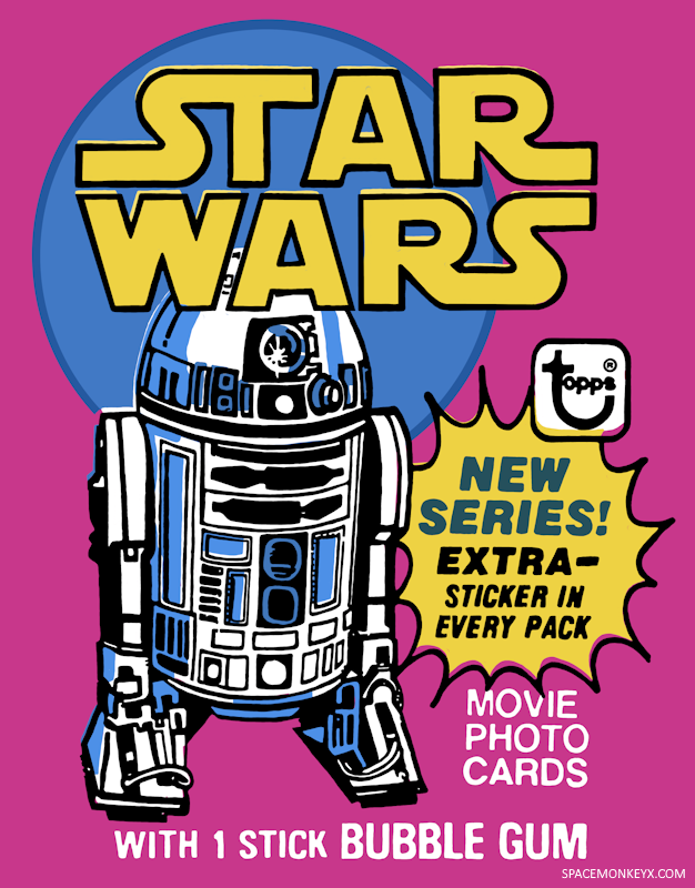

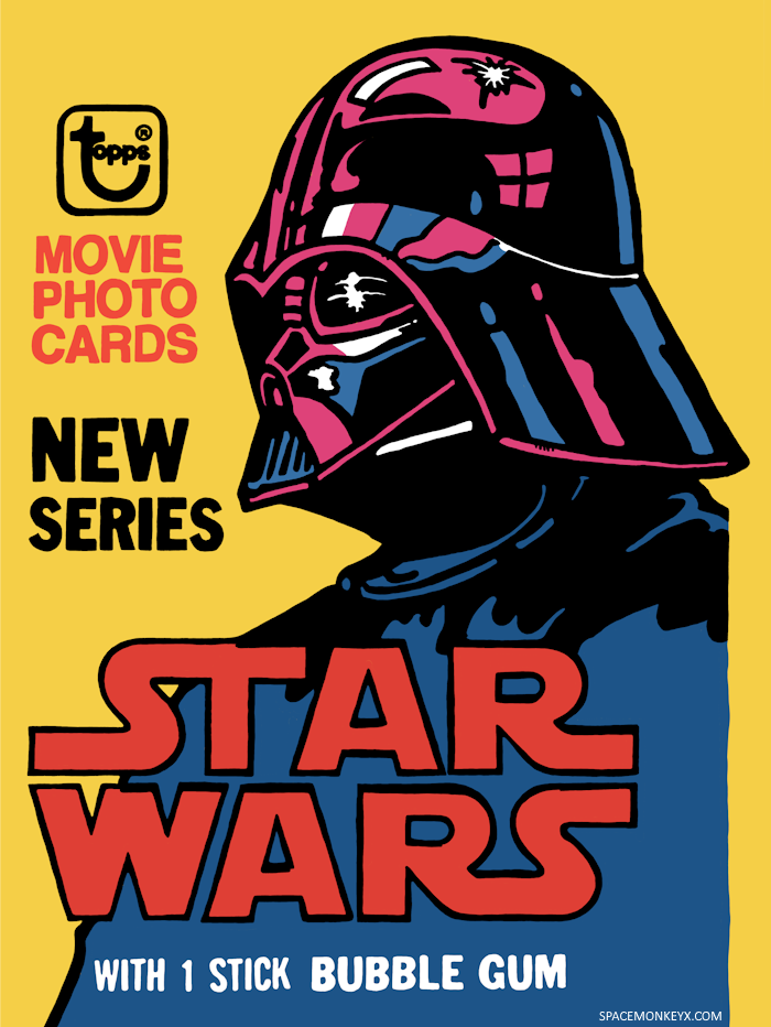


At first, I was really trying to recreate the packaging as closely as possible, halftone printing dots and all. I found a few Procreate brushes that mimicked the halftone aesthetic, but after some experimentation, I decided that I wanted to try to restore the spirit of the original artwork that was “ruined” by the cheap printing process. So, for now, I’ve opted to leave off the halftone look, in favor of simply filling in areas with solid color. I could see me revisiting the idea of adding the printing dots in the future, though.
You can see in the image of C-3PO below, the one on the left is the original with the halftone dots, while my “cleaned up” version without the dots is on the right (and I just noticed I missed a white spot in the background! That’s going to haunt me for days…)(I fixed it the same night I published this post)

One aspect of the printing process that I have kept is the overlaps. Halftone printing for illustration is accomplished by creating plates for each color, typically four – Yellow, Cyan, Magenta, and Black – and then putting them down one at a time, mixing the inks until the desired color is created. Black is usually the last one printed as it outlines the artwork. When I trace these packages, it’s essentially the same thing I’m doing with layers in Procreate, with the black outline being on top of all the colors.


| Layer 1: Black Outline | Layer 2: Colors | Layers 1 & 2: Final Image |
Because these were just the packages that kids would immediately throw away once they tore them open, making sure that these separate color plates were perfectly aligned was not a priority for the printing company. So, it’s not unusual for the plates to overlap, causing the black outline to be slightly off-centered from the colors. Sometimes, unintended colors could occur if two plates mix while the ink was still wet. For example, the green line around the outside of this Back to the Future II waxpack where the cyan background and the yellow plates mixed (you’ll also notice that the magenta seems a little off-center, too):

Sometimes these overlaps are barely noticeable, while other times they render the image barely recognizable. Personally, I find these overlaps to be one of the most charming aspects of waxpack packaging, so recreating them is a priority for me.
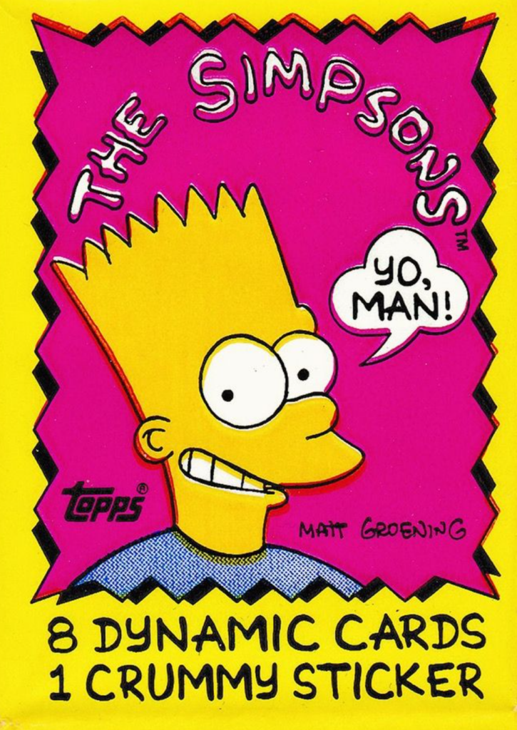
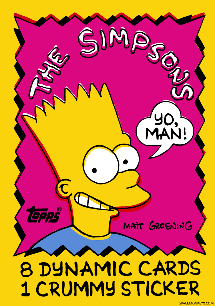
The printer of these Simpsons cards didn’t line up the plates correctly at all.
Check out all the pink in Bart’s hair, the yellow on his teeth, and the show’s title is a mess! I love it!
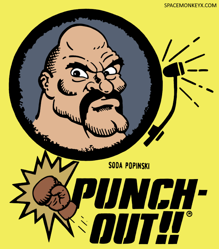
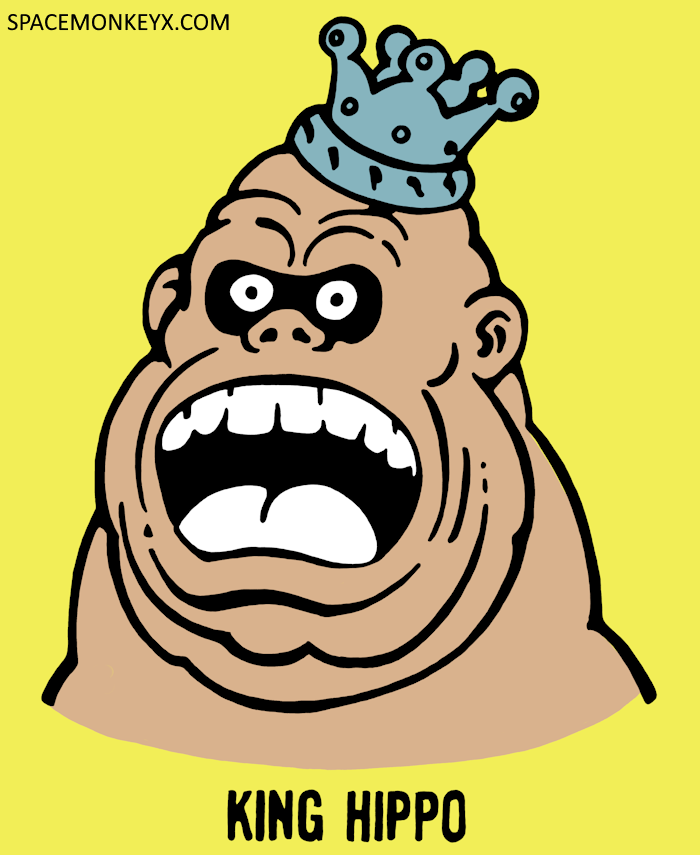
Tracing these old waxpacks has become my new obsession at the moment. I’m often searching online for new packs to draw with varying results. I prefer tracing open packs because I’m able to see all of the artwork, but most of the time all I can find are sealed packs of cards. Unfortunately, this means that I’m at the mercy of how the machine folded the wax paper over the cards forty years ago. Sometimes the artwork is crooked or off-center, but the real problem is that the very nature of being wrapped around a 3-D stack of cards means that I’m not getting the whole image. There are a few cards that I simply cannot find better photos of, so I’ve made do with what I have, sometimes taking the main artwork from one photo and then using a different photo for the text that shows what you’ll get inside each pack (i.e., 10 cards, 1 sticker, 1 stick of gum). I’ve even considered getting a few of these hard-to-find packs off eBay just for the packaging. I haven’t gone that route just yet, but I could see it happening soon.
One thing I want to mention about all of this is that I am fully aware that I’m not creating anything here. I’m standing on the shoulders of giants, literally tracing someone else’s artwork. That being said, I have put my website address on the artwork I’ve posted, simply so that people can come back here to find more if they happen upon one of these images online. The website address would be easy to crop out or erase, so I’m not trying to watermark these images in some sort of attempt to get credit for them. This is all just a way for me to unwind, to unplug, and appreciate the work of others who probably never got the credit they deserved. I hope you’ll appreciate my recreations in a similar spirit.
Like I said, this is a new obsession for me, so I’ll probably be updating this post often with new designs. Check back for more in the future! And if you have a waxpack you’d like to see recreated, let me know in the comments and I’ll do my best to make it happen!

These are fantastic! They really look great on the shirt too.
Thanks, man!
This is a totally rad project! I love how you show the layers of your work.
I can relate to the calmness of tracing something. Before Covid, when I had a 40-minute train ride, sometimes I would trace the inscriptions of baseball player autographs. I have a digital collection of cards where baseball players sign with a Bible verse. I have over 1,400 images—mostly from eBay. But I’ve traced only a handful of the inscriptions. Maybe like 20 or 30.
Recreating these from wax is so great for the reasons you outlined in this post. There’s also the tangible… what’s the word… the FEELING of the wax wrapper in your hand. It’s like a sensation, that when you see the wrapper, you can also feel it.
Your act of tracing the wrappers kinda evokes this same sort of sensation. Excuse me as this is rather abstract… but with wax, your mind feels the wax. When you trace it on your computer, it’s like your finger is tracing over all the lines. There’s a sort of tangible act when you trace them.
I can understand your disclaimer of why you put your URL on there. You want people who find these to know who did the recreation of the wrappers. That’s totally cool. I dig it. If i found this online somewhere, I’d totally want to know who does these. And BAM, there are MORE of them? Goldmine!
Plus, you are going through this reenactment of the wax. There is a sort of… um, oh man, I’m thinking in art theory terms… there’s a sort of performance to this. Not so much performance, because people don’t watch you do this. But there’s definitely some artistic merit to recreating the wrappers. You aren’t just hitting a button and making them look nice. You are going over every little detail. It’s almost like sitting in a museum and sketching a masterpiece.
Through this exercise, you are becoming very familiar with each wax pack.
The tech side of me has so many questions:
1. Are you tracing the black too?
Or somehow are you getting that from Photosh–I mean, Procreate.
2. I see when you trace the colors, it looks like you are tracing the actual color.
For example, when you trace the green color, you are making it actually green. Have you thought about tracing the green as two layers? One as a blue shape, another as a yellow shape?
Or a better example might be a color where one of the CMYK layers would be a shade. For example, if there was a purple color. The magenta would be 100%, and the cyan is more like a 60%.
I imagine it would be more work doing this, because you’d have to figure out the correct percentage that makes each color. If you use the eyedropper tool, it will give you the values for each of the C,M,Y, and K channels. (I’m a Photoshop guy, so I’m guessing this might work in Procreate.)
So then when you go to trace purple, you’d first trace your shape like how you are working. Then you’d clone that shape. One of the shapes would be filled with the 100% magenta. The duplicated shape would be the 60% cyan.
If you do these as cyan, magenta, yellow, and black layers, then your off-register effects would happen automatically.
3. Are you doing this in raster or as vector?
For some reason when I see these, I’m guessing they are raster. If they are raster, what DPI are you doing these in? I’m just thinking in terms of when it comes time to print them out. It looks like the resolution is good on the tshirt. When I did my tracings on baseball cards, I did them as vector artwork, so they can be magnified to any size.
Keep up the great work! I can’t wait to see more!
It might be interesting to make a dedicated Instagram account for these. I’m not a fan of Instagram (I don’t post there anymore), but it would be nice to have these in a gallery view. I can see them being popular as well. Not that that goal is popularity. You are doing these as a relaxing exercise.
The vertical format of these would fit nicely with Instagram’s new vertical format in the grid. And wow, the bright colors would really look fantastic in a grid. Ironic that I’m suggesting you post these on Instagram when you specifically said you are making these to avoid scrolling social media doom.
It’s hard for me to pick a favorite, so many of them are good. Right now the Ewok and Jabba gets me, because my cousin recently gave me an unopened pack of each of those. I still haven’t opened them, because I love the idea of them being wax packs with cards. The Dinosaurs Attack pack really struck me. I haven’t ever seen or heard of Dinosaurs Attack. But it’s got a really striking graphic.
Thanks, Matt! I love all of your observations about “feeling” the artwork. Doing this has definitely given me more appreciation for the work these long-forgotten illustrators did.
To answer your questions:
1) Tracing the black is the biggest step. I do *everything* – even all the fine little details. Thanks to the zoom feature on Procreate, it’s not difficult to do, but it is time consuming.
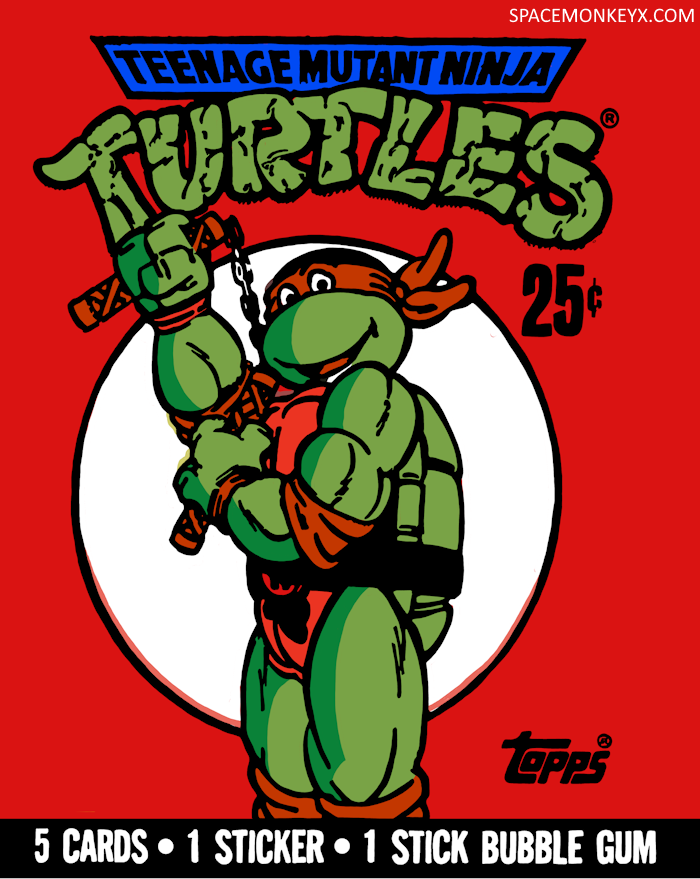
2) I hadn’t thought about trying to somewhat replicate the layering technique of halftone printing like that, but it could be fun to play around with it! I typically use the eyedropper feature to snag the actual color and just fill in the shape with that. Of course those colors are taken from online photos, so depending upon the lighting, the camera, the image compression, etc., the color I use might not be the same that you’d see in-person. I’ve noticed that some of my TMNT ones look different from other photos I’ve found of the same packs for this very reason.
3) I’m doing it as raster in Procreate. I considered doing them as vector, but, quite honestly, these take long enough as it is without having to worry about nodes and curves and whatnot. It’s nice to be able to just draw a really long curve with my Apple Pencil instead of trying to bend a curve just right. If there are better programs out there that would allow for this type of simple vector design though, I’d probably switch. I don’t remember off the top of my head what the resolution is, but, yeah, when I made the shirt, it came out looking pretty good. I created a document template in Procreate specifically for t-shirt designs that I’ve been using for these, so I set the resolution pretty high with that intention.
I could see me making a dedicated Bluesky account, but, yeah, I don’t do Instagram anymore. For political reasons, but also just because I was so frustrated with the platform’s shift towards video content and the timeline shuffling, I deleted my account a while back. We’ll see. For now, it’s just a fun project that I do in my spare time. Thanks again for your kind comments and for reading the site!
Keep it up. Its very satisfying to look out, but you are also getting some new eyeballs on as you point out is art that people often just tossed.
Also agree with you on the overlap. It is so charming.
Thanks for the kind words! I have to say, even I wasn’t very appreciative of the artwork until I started working on this project. It has brought a new sense of appreciation for these uncredited illustrators.
It’s fun seeing these wax pack wrappers. It reminds me of when you could go to pretty much any store and pick up some pack of cards. I suppose Target has cards, but I don’t really like dropping $10+ for one pack of cards. Or $25+ for a hanger box of cards. Like, I wish Walgreens sold packs of cards. They sell Topps hanger boxes. And those remixed cards in a hanger box. But there’s something really tangible about the wax pack.
Nowadays, when I open a “pack”—which is actually a box—of cards, I’ll take one card out a day. Which reminds me. I have a 36-card “pack” of 2025 Topps Update Baseball I’m working through. To keep to the theme of your post, I should get some retro wax packs and take out one card a day from those.